.jpg)
Branding Campaign
MEDIUM: InDesign & PhotoShop
Created around September 2024, this brand design started as the class
first project called a Type Specimen Poster. In Typography I (DESN
615), the class created this major project to learn the history of the
typeface that we chose to present and take the information we
researched to turn into a poster. We had to find typefaces that were
easy to access, plus finding the designer and the year the typeface
was created. We also have to find a interesting quote or tagline that
relates to the typeface we researched. We are only limited to use the
typeface character set, no imagery, and up to four different colors.
The class first ended up having to sketch a few different compositions
of the poster. Later, we transferred our sketches and recreated the
position on InDesign in black & white.
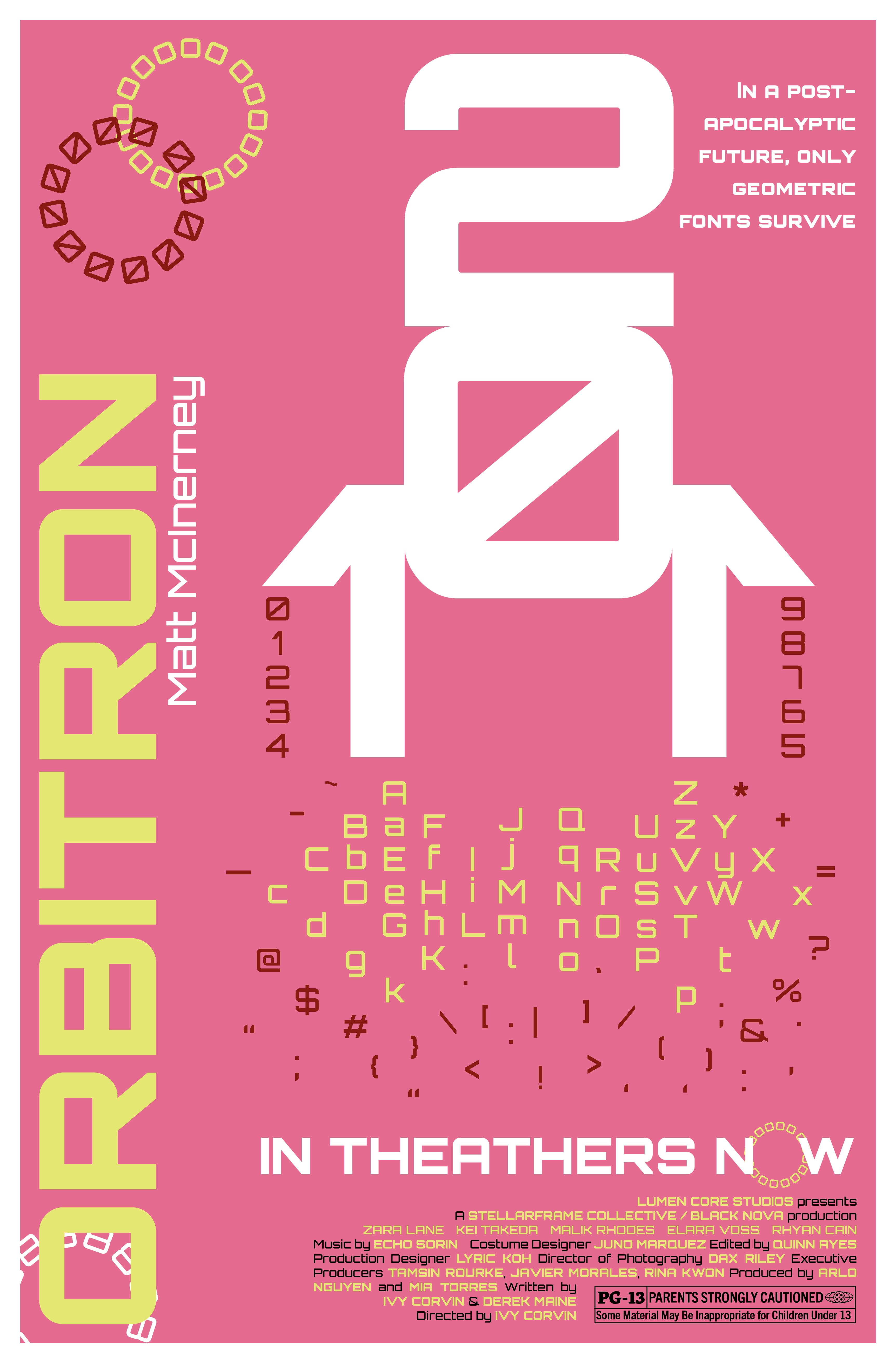
I ended up picking the typeface called Orbitron which is created by
Matt Mclnerney. I focused on creating a sci-fi look of the poster,
since this typeface looked very futuristic. I thought of making the
year of the font face as a shape of a rocket and using the character
set as flames from the rocket. I put the name of the front and the
creator at the side-up beside the poster. I use the character set of
letter O and number zero to create a link chain decoration. I choose
the colored red, yellow, and pink because I do not like to create
redundant work, for example most sci-works have the dark and muted
theme colors and I would like to try something different. The
creator's quotes were at the bottom right and were later replaced when
the poster later was redeveloped as a movie brand campaign.
The typeface specimen is recreated as a movie poster. The creator's
quotes were replaced with the date release of the movie, names of the
cast & crew, and the aged, restricted rating for the movie. A tagline
was placed beside the year, which were the small snippets of the
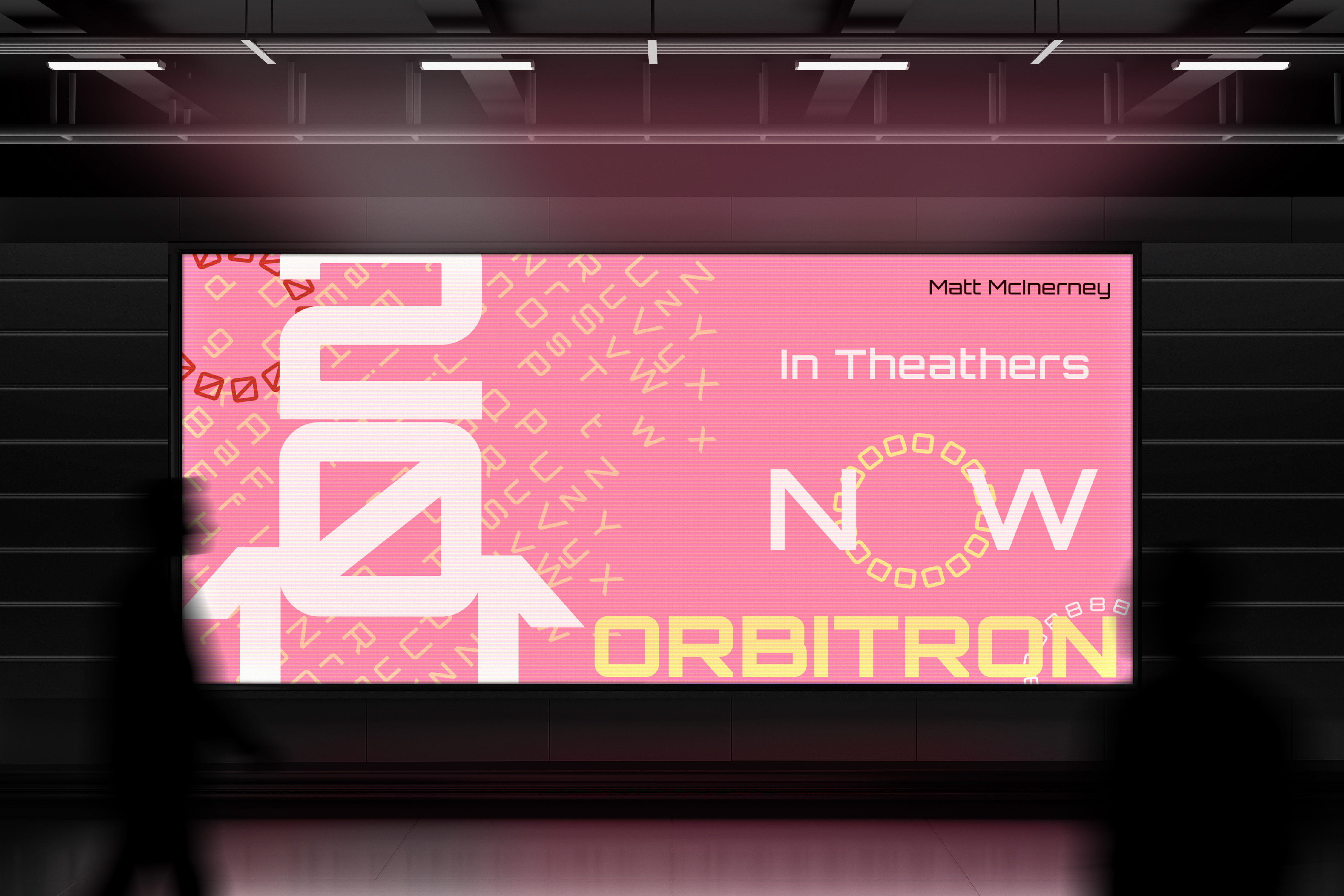
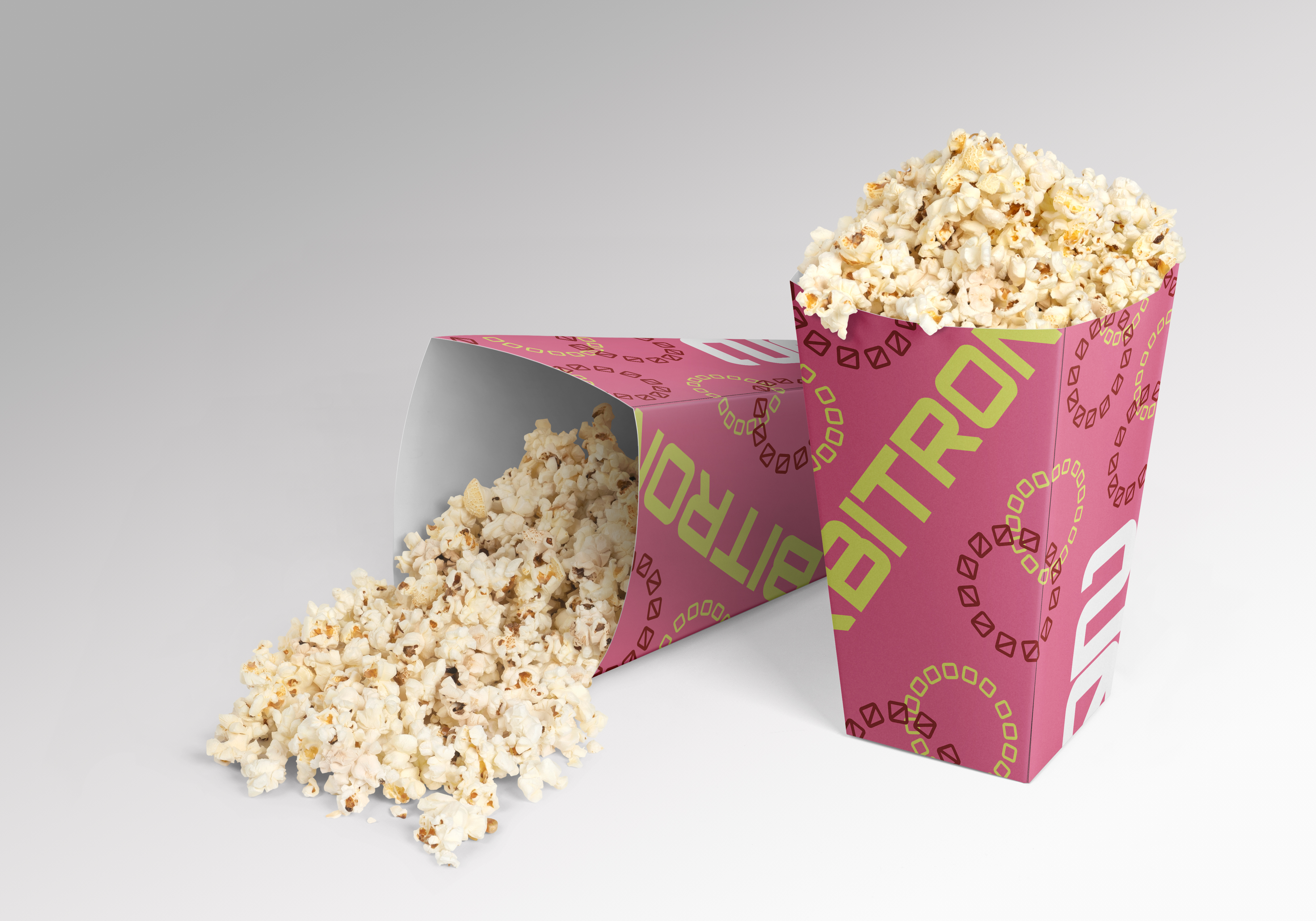
creator's quotes. Along with the poster, I created a few mock-ups that
relates to the brand such as a subway digital billboard and a popcorn
bucket for moviegoers.