.jpg)
MEDIUM: InDesign & PhotoShop
In June 2024, I was hired by Daniel Gellasch, who was the Director for
the Ethics Outreach and Programming for the University of Baltimore’s
Hoffbereger Center Ethical Engagement. As the Administrative Publishing
Design Lead and student for the Internship class (DESN 775) I have to
digitally create the third edition of Pro Tanto. Pro Tanto is an
academic journal created for the Hoffberger Center Student Fellows
Program. The Student Fellows are undergraduates who use the journal to
share their articles on philosophy, law, and ethics. Every fall, a new
journal edition is released with its theme. My role was to design the
cover and the pages of the academic journal. This journal intends to
reel in specific audiences. It will be attached online on the Hoffberger
Center page as an interactive PDF and printable. What is essential is
that the journal should be accessible for everyone to read, including a
person with low vision. I followed the ADA guidelines based on color
contrast and color blindness.
The journal is intended to be seen by users who frequently scroll
through the University of Baltimore site, especially new students.
First-year students interested in studying Philosophy, Law, and Ethics
and students interested in joining the Student Fellows Program can
scroll through the journal and get an idea of how the ethics program
will run. The journal will be formatted and refined for viewers who are
job recruiters. Giving the journal a scholarly look can make the
decision-making of the recruiters easier for the student fellows to be
chosen for job positions.
This academic journal aims to provide student fellows with the
opportunity to investigate and discuss their scholarly ideas with the
reader. The Student Fellows spend their whole semester tailoring their
research to their academic experience. They use their disciplinary and
real-life experiences to assemble their understanding of ethics and
philosophy in the real world. They also had to correspond their articles
based on the theme the Research Fellow gave them. The purpose of
digitally designing the journal is to match the theme and the tone of
all of the student fellow's articles. The journal's design must be
neutral, simple, and striking toward a viewer's perspective. The
journal's style should be moderate and focus significantly on the
student fellow's article.
For this edition, InDesign is the best program to start an academic
journal, mainly since the program is used to design books and pamphlets.
Before starting the journal, I looked up more information about the
Hoffberger Center and its history. Mr. Gelleasch then required me to
design pages and placeholders for the third edition of Pro Tanto. I used
InDesign to create pages and draft placeholders where I placed the
images, body texts, title, and the Center's logo. I developed the
placeholders for the Directors Page, Student Fellows Page, Table of
Contents, Staff Page, chapter pages, and biography pages. After I sent
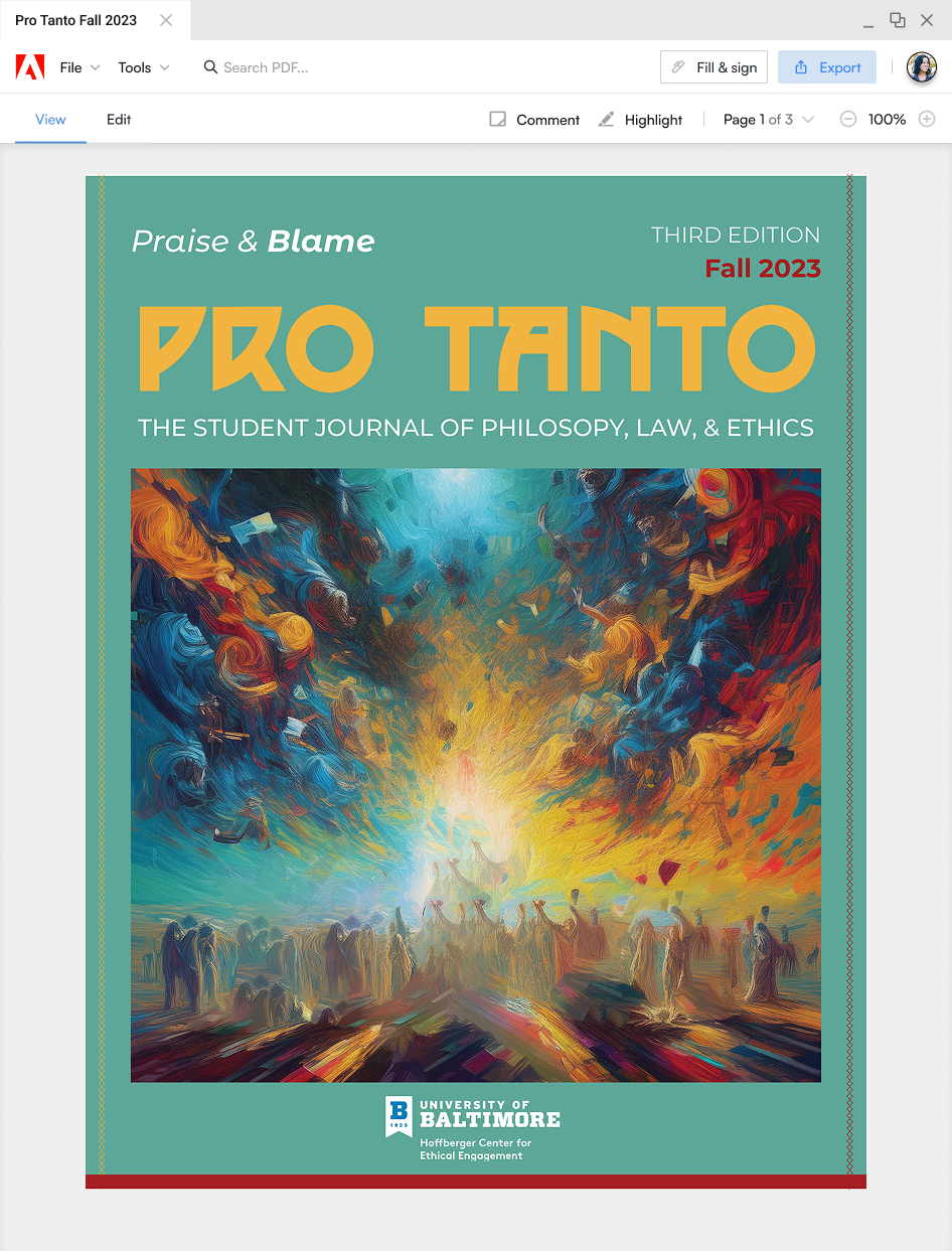
the mock-up placeholders to Mr. Gelleasch for review, I created three
different journal styles based on this edition's theme, "Praise and
Blame." For the fonts, I used a method that I did in a typography class
back in community college called "Type Trials." I used this method to
look for 36 types of fonts for the journal title, 14 subtitle fonts, and
four body text fonts for the articles. I ensured these fonts were in the
public domain and from Adobe and Google. I used font generators like
FontJoy to reduce the number of fonts used to generate a match for these
fonts. Then, I used ChatGPT to declare which fonts are suitable for the
journal, separating them into three font styles — title, subtitle, and
body type —which closely should match the theme for this edition.
For colors, I looked through other existing article journals, and they
used neutral or pastel colors. The critical appearance of academic
journals is not to be radiant and distracting but to appeal to the
viewers. Once again, I asked ChatGPT to show 20 different neutral or
pastel colors that match the "praise" theme first, then the "blame"
theme. Surprisingly, ChatGPT pulled up "praise" theme colors, which came
out very bright, and the "blame" theme has a small number of bright
colors but mostly darker colors. I spent a few days on Adobe Color,
using their accessibility tool to check the background and text colors
to see which passed the WCAG Accessibility criteria and grouping those
colors by color blind safety. Doing the contrast checker helps reduce
the number of colors sorted into three drafted styles.
I also added minimal lines, styles, and shapes to make the look of
journal drafts interesting. I used the ruler and guides for the journal
to measure the spacing needed to add more assets. I use the
character/paragraph rule and parent pages to set up the rule of page
numbers and font formatting so I did not have to manually build the
assets for each page. I created a pyramid shape to stack the staff
images to accommodate the Hoffberger logo and title spacing. I used
Photoshop to remove the background behind the student fellows since I
only needed their bodies inserted in a framed background on InDesign. I
used Adobe Firefly, DALL-E from Microsoft Bing and Google Images to
avoid getting copyrighted images online. Sadly, the book design does not
meet the standards for the Hoffberger Center and I ended up using it for
my portfolio and later expand it as a mock-up of what it will look like
as an open book.
.jpg)
.jpg)